Pantone may have declared white, but retailers and consumers are choosing rich greens for 2026. Explore why emerald tones are dominating—and how Deepwear helps brands source, dye-match, and produce trend-ready collections with confidence.
Recall how last year we unpacked Pantone’s 2025 “Color of the Year,” Mocha Mousse — a warm, earthy brown that harmonized with growing consumer appetite for grounded, natural, and sustainable aesthetics. As we wrote then, Mocha Mousse lent itself gracefully to designs rooted in comfort, sustainability, and a kind of comforting authenticity.
This year, however, something different happened. Pantone broke the mold. Their 2026 color pick — a soft white tone — feels less like soil and roots and more like blank space. Meanwhile, the rest of the industry from WGSN and Coloro to independent designers on Threads called it early:
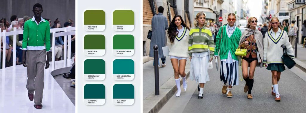
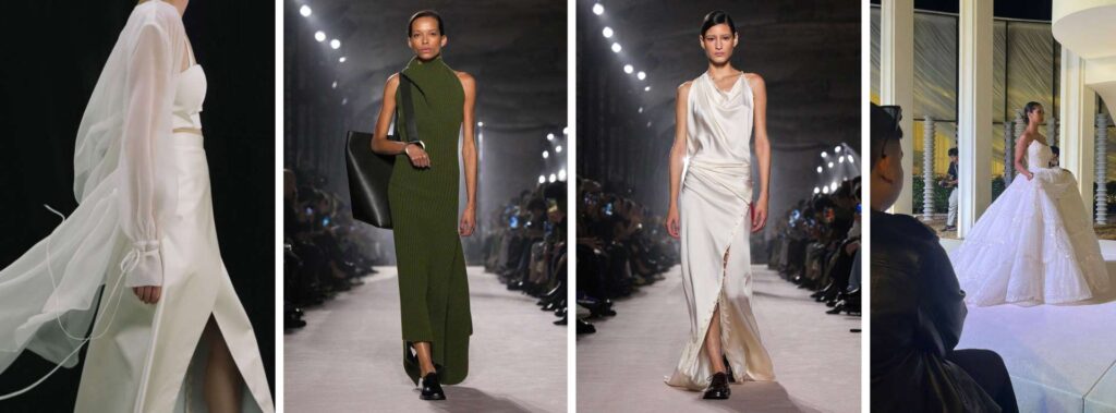
2026 belongs to green.
Phtalo green. Teal. Emerald. Jewel tones. Depth, richness, escapism.
Unlike Pantone’s polished announcement, this movement rose organically from culture, cinema, retail data, and design communities around the world. Retailers and brands preparing their 2026 capsules are now asking:
Which colors do customers actually want — and what should they source?
Let’s break down why green is the real 2026 story, how films like Wicked: For Good and Frankenstein shaped the moment, and how retailers and brands can refresh assortments sustainably (without overproducing new SKUs).
In this blog we cover:
- Why Pantone’s 2026 white misses the cultural and commercial moment
- How greens, teals, and jewel tones became the people’s choice for 2026
- The role of Wicked, Frankenstein, and cinematic color storytelling
- How recession signals influence color cycles — and why consumers are resisting neutrals
- Practical ways retailers can refresh 2026 capsules without overproducing
- How Deepwear supports smart, low-risk sourcing for emerging and established brands
The Reality of 2026: A “Blank Canvas”or a Sign of Retreat?
Choosing a white or neutral for 2026 can reflect a desire for simplicity, calm, and reset. In certain contexts — minimalism, “clean” design, and universal appeal — white is a versatile and commercially safe option. But is it the right choice for the cultural moment, especially when the rest of the industry is forecasting green as the true 2026 color trend?
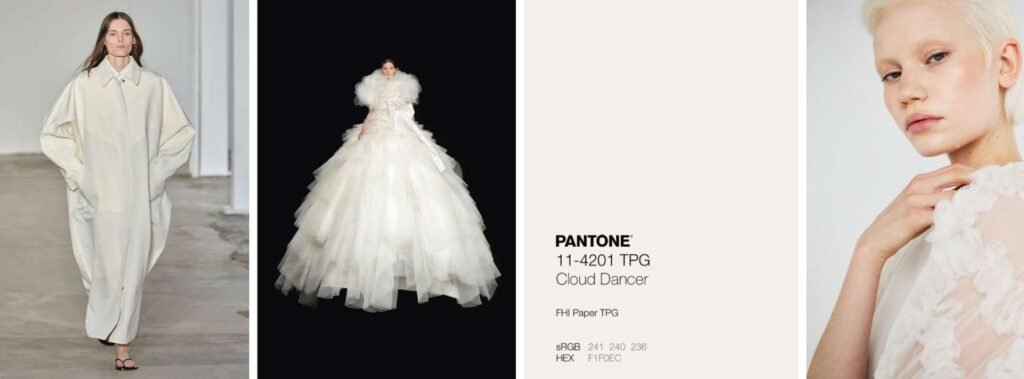
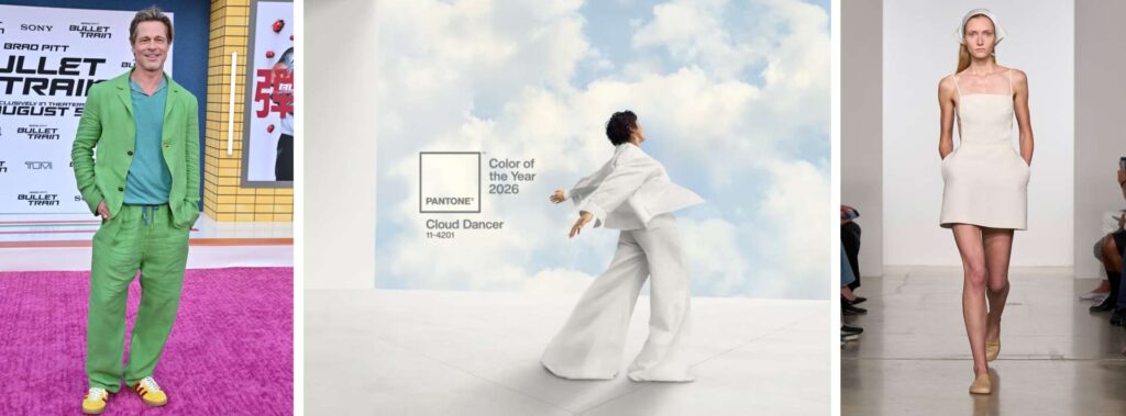
Historically, during periods of economic strain or recession signals, global color cycles retreat into neutrals, particularly whites, creams, and soft greys. These shades signal caution, restraint, and a collective desire to pause rather than experiment. Pantone’s Cloud Dancer aligns with that logic: a minimalist reset during an uncertain financial outlook.
But this is exactly why so many designers, retailers, and forecasters felt the Pantone 2026 choice missed the moment. Consumers in 2026 are not asking for neutrality or retreat. They’re seeking emotional color: hues that communicate renewal, identity, and escape. Jewel greens, teals, and saturated gem tones resonate because they offer what a recession cannot: optimism, imagination, and energy. White may reflect economic conservatism, but green captures cultural momentum.
Across design communities, social platforms, and industry conversations, many see Pantone’s white selection as out of step with reality. After years of earthy browns, deep jewel tones, sustainability-focused palettes, and cinema-inspired color stories, the abrupt shift back to white feels less like a statement and more like surrendering the narrative.
In other words: 2026 doesn’t need a blank canvas; it needs a direction. And green has already taken the lead.
Why the White Choice Felt Off and Green Struck a Chord
After two years of minimalist palettes, consumers are shifting toward emotional color, richness, and symbolic hues. This isn’t a random trend or a simple aesthetic swing — it’s a response shaped by economics, culture, and behavioural data. Below is what’s driving the move away from white and toward deeper, more meaningful color stories:
- Desire for emotional color and richness: Consumers want garments that feel alive: expressive, emotional, meaningful. Green and jewel tones bring warmth, depth, and personality in a way white never could.
- Cultural surroundings: film, social media, design moodboards: A new wave of visually rich films, fantasy-influenced cinematography, and “color as identity” postings on social media gave emeralds, teals, and jewel hues renewed resonance. These colors began to feel like narrative tools; not just fashion choices, but statements.
- Data & consumer behaviour: Analysts at WGSN (in partnership with Coloro) predicted a shift toward “Transformative Teal” for 2026, defined as a fluid fusion of blue and aquatic green, associated with change, renewal and resilience. Their forecasting noted rising search and purchase interest in greens/blues, and that 98% of consumers say color strongly influences their buying choices.
- Sustainability & meaning-driven buying: In times of global uncertainty — economic, social, environmental — color becomes more than aesthetic. It becomes symbolic: of renewal, hope, identity. Jewel tones and greens link to nature, renewal, depth which are values that resonate more deeply than blank-slate white.
In short: the backlash to white isn’t just aesthetic. It’s emotional, cultural and commercial, and it’s rooted in real data and lived experience.
Where Deepwear’s Earlier Forecast Got It Right
Back in our earlier post “2026 Fashion Forecast: Film-Inspired Silhouettes Retailers Should Source Now”, we identified the same undercurrents: a growing appetite for emerald greens, jewel-saturated palettes, and cinematic color storytelling. We saw demand from clients for draped silhouettes, textured knitwear, romantic layering and meaningful jewellery — all tinted in jewel tones.
That wasn’t wishful thinking; it was forecasting based on real buyer interest and supplier signals. Cloud Dancer’s white feels like an outlier. Green feels like a continuation.
What Retailers Should Actually Do for 2026
To turn green’s momentum into commercial success — without overproducing — Deepwear has a practical plan centered on capsule refresh, strategic sourcing, and narrative marketing:
Capsule Refresh & Color Injection
You don’t need to overhaul your entire collection. Small, strategic updates can create new energy without excess risk:
- Add emerald or teal linings, contrast piping, enamelled buttons, color-blocked panels to existing garments.
- Use jewel-toned yarns, slub textures, intarsia details in knitwear to bring richness.
- Introduce accessories & jewellery — malachite-inspired stones, enamel hardware, green-tinted glass — to add narrative and perceived value.
- For outerwear/utility pieces, consider contrast stitching, pocket trims, toggles or hardware in green/teal accents for commercial appeal.
- Highlight romantic draping, fluid overlays, asymmetric hems in jewel palettes for pieces with movement or statement potential.
This refresh-not-replace strategy allows retailers to test the green/teal mood with minimal financial risk and no unnecessary waste.

Anti-Overproduction & Small-Batch Strategy
Rather than overcommitting to large SKUs based on a color announcement, treat 2026 as a year for lean agility:
- Use low-MOQ runs for experimental colorways.
- Launch micro-drops or low-risk capsule collections to gauge sell-through.
- Offer on-demand reorders based on actual demand rather than pre-season forecasts.
- Favor materials and details with versatility and longevity to ensure pieces stay relevant beyond the trend cycle.
This approach protects margins, reduces risk, and aligns with current consumer values: minimal waste, thoughtful purchasing, emotional resonance.
How Deepwear Supports Smart 2026 Color Strategy
With sourcing and production networks across China, India, Thailand, Vietnam and beyond, Deepwear offers hands-on support for turning green-based concepts into retail-ready products:
- Color matching & dye coordination — We work with mills and dye houses to match jewel greens, teals, and accent trims across different fabrics and accessories.
- MOQ and production guidance — We advise realistic MOQ ranges for colored yarns, enamelled metals, trims, and small-batch accessories.
- Capsule refresh planning — We help map which existing silhouettes make the most sense for color injection and which need minimal pattern changes.
- Supply-chain transparency & feasibility checks — We ensure lead times, fabric availability, and cost efficiencies before you commit.
- Story-driven sourcing — We help translate cultural cues (cinema-inspired palettes, jewel tones, nostalgic influence) into commercially viable garments; not costumes, but wearable, retail-ready pieces.
Interested in securing stable dye lots and reliable suppliers for your next color-driven capsule? Connect with Deepwear’s sourcing team through our contact page and we’ll map the best production routes based on your timelines, MOQ needs, and budget.
Why is emerald green trending for 2026?
Emerald and jewel-tone greens align with cultural mood, film releases, and consumer psychology, outperforming Pantone’s announced White. These tones photograph better, sell better, and integrate easily into multi-season capsules. Deepwear helps brands validate color trends through on-ground sourcing, fabric testing, and real-time retailer demand insights.
The Real 2026 Color Story: Why Green Will Outsell White
Pantone may have crowned Cloud Dancer as the 2026 Color of the Year, but the market is already writing a different story. Forecasting platforms, film influence, social moodboards, and early retail data all point in the same direction: green is the true commercial power color of 2026. Emeralds, transformative teals, and saturated jewel tones aren’t just aesthetic choices — they signal optimism, identity, and renewal in a way white simply doesn’t.
That’s why the reaction to Pantone’s pick has been so muted. Neutral tones may align with economic caution, but they rarely spark desire or drive meaningful purchases. Consumers want color with presence, depth, and emotional weight, not a shade that fades into the background.
If white is the whisper, green is the headline, and shoppers are reading it.
Strong color strategy becomes profit when supported by real sourcing, real testing, and real factories. If your brand wants to launch a 2026-aligned collection with confidence, Deepwear can guide every step—from trend validation to dye-matching to production oversight.
Start your project with us today and build the color story your customers will buy.